Actions
3Button, Floating Action Button, Icon Button
Jetpack Compose gallery
Material 3 components, rendered as real Compose screens.
A browsable catalogue for Jetpack Compose and Material 3: 52 components across 11 groups, each with a detail page, written description, related links, live demo, and expandable Kotlin source.
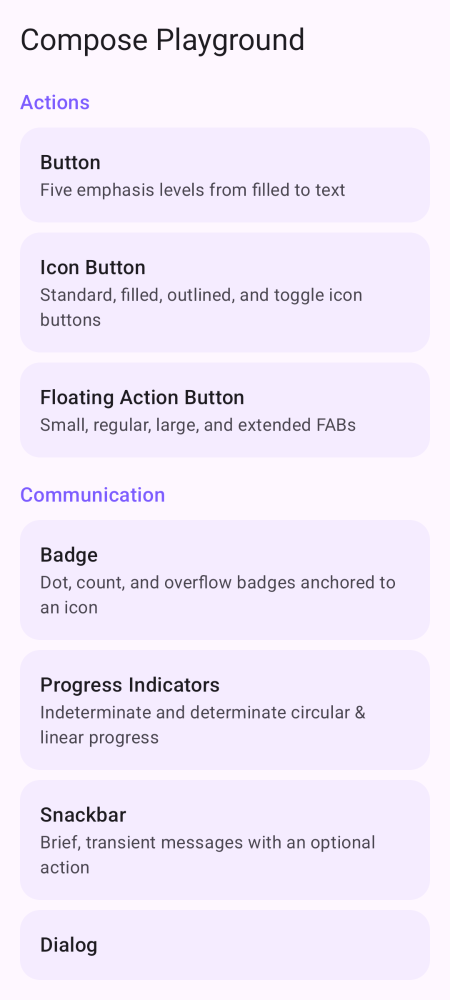
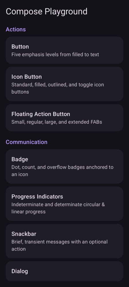
Snapshot backed
The gallery is backed by Paparazzi snapshots rendered on the JVM, so the documentation images and the regression tests come from the same Compose surfaces.
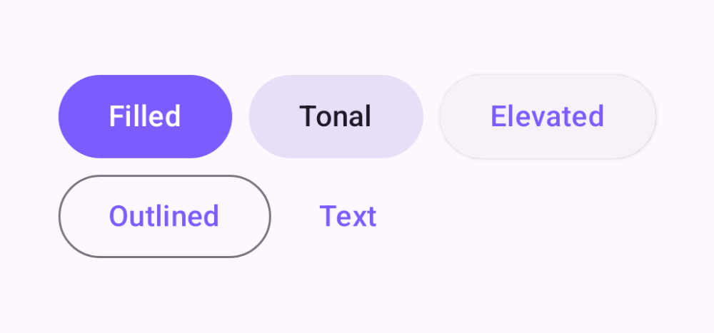
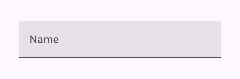
Component catalogue
Browse by group or search across the whole catalogue. Each component keeps its demo and Kotlin source together, which makes examples easy to inspect and copy.
Button, Floating Action Button, Icon Button
Badge, Dialog, Progress Indicators, Snackbar, Tooltip
Card, Divider, List Item, Modal Bottom Sheet
Bars, drawer, rail, menu, tabs
Checkbox, chip, pickers, radio, segmented button, slider, switch
Text and Typography, Text Field
Box, Row and Column, Spacer, Surface
Lazy lists, grids, pager, staggered grid
animateAsState, AnimatedContent, visibility, crossfade, infinite transition
Clickable, draggable, pull to refresh, scroll, swipe, transformable
Canvas, draw modifiers, gradients, shapes and clipping
Stack
The app is Kotlin 2.0.21, Jetpack Compose with Material 3, Navigation Compose, AGP 8.7.3, and Gradle 8.9. It uses fledge, spec-sync, GitHub Actions, and a self-hosted macOS runner for the project workflow.
This CorvidLabs page now owns the public product entry point. The older GitHub Pages deployment can remain an implementation detail, but the site catalogue should keep visitors on corvidlabs.xyz.
stack
language     Kotlin 2.0.21
ui           Jetpack Compose + Material 3
navigation   Navigation Compose
snapshots    Paparazzi, JVM, no device
build        AGP 8.7.3 / Gradle 8.9
sdk          compileSdk 35 / minSdk 24
Project discovery, catalogue context, screenshots, and source links now start here on the apex site.